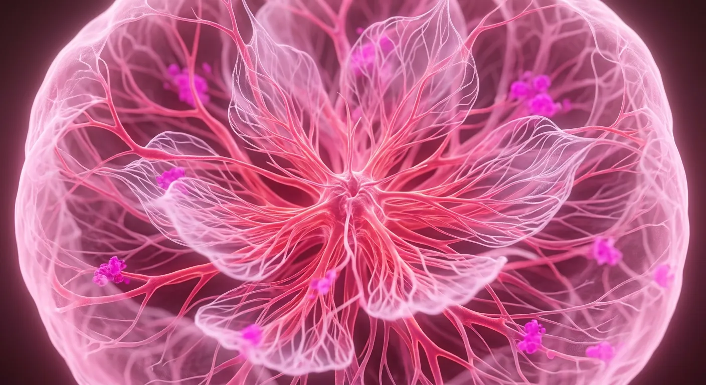
how each colour is learned
What a colour is made of
A colour is the felt residue of the things that carry it: sky and water make blue cool and distant, blood and fire make red urgent.
Black
Black is night, unlit caves, and eyes shut tight.
Black is not a blank slate, but the felt weight of vision being physically stopped. You learn what it means long before you have a name for it: standing in a closed room, looking down into deep water, or trying to see into a cave where light simply fails to return. It is the visual record of everything hidden, blocked, or brought to an end. The sense of depth, mystery, and finality in the color comes directly from a lifetime of facing real things that cut off sight, the dark of night, the silence of shadow, and the total absence of life when breath and movement stop.
The mind does not shut down when light stops reaching it. When you enter total darkness, the cells in your eye keep working, and the parts of your vision that respond to a drop in light become very active to show a sudden change. The mind understands darkness not as nothing, but as a strong, clear picture of a boundary reached. When your eyesight meets a wall of zero light, it does not show something neutral; it brings up the shared pattern of every unlit space, cloaked object, and unseeable depth you have ever moved through. You cannot separate the feeling of black from the physical reality of those conditions. What feels like an innate, mysterious quality inside the mind is really just the gathered memory of the real world hiding its edges, smoothed into a single, heavy experience.
White
White is snow, fresh paper, clouds, and bright daylight.
White does not have an intrinsic visual personality that makes it feel clean, pure, or sterile on its own. It looks that way because the objects we consistently encounter with high brightness and no color share those physical properties. When you look at snow, fresh printer paper, scrubbed tile, bright clouds, and soft mid-day light, your eyes are seeing surfaces that reflect almost all incoming light without absorbing specific colors. Over time, your mind connects the physical characteristics of these specific surfaces, their high shininess, their tendency to look brand new or cleared of debris, and their open, empty space, directly into how you see and feel about the color itself. If we grew up on a planet where the only white things were toxic ash, bone, and mold, white would feel dangerous and decaying instead of calm or pristine. The raw feeling of white is just your mind's quick memory of those physical interactions. The feeling of emptiness, sterility, or high glare isn't some abstract property of light hitting your eyes, it is simply the gathered memory of every clean surface and cloud cover we have ever seen, projected back into what you see right now.
Red
Red is blood, fire, and clay, gathered into heat.
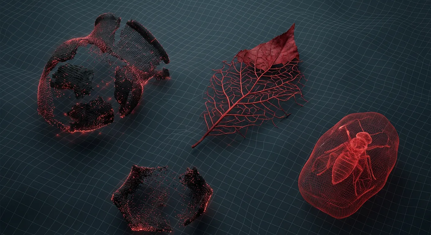
Red feels hot and urgent because the color never arrives alone in the real world. You learn it from fire that burns your skin, blood spilling out of a fresh wound, clay baked under a summer sun, and the sky going dark right after sunset. Every time that specific shade shows up, it comes tied to heat, pain, extreme effort, or the sudden need to move fast. Red gets its intensity directly from those encounters. The feeling of the color is just the accumulated weight of those physical things, so even a flat square of red paint on a dry wall carries the same quiet threat of heat and damage.
You can see this weight the moment you put the color on the wrong object. Paint an apple green and it looks like a green apple, but paint a cube of ice red and your hand hesitates before reaching out to touch it. The visual sensation of cold collides directly with a lifetime of learning that red things burn. If red were just an abstract property of light, the color on the ice would not change how cold you expect the surface to feel. Red feels warm, alert, and dangerous because it is made out of the fire, the blood, and the clay.
Brown
Brown is wet soil, tree bark, and rotting leaves.
Brown is the color of things that stay put. When you look at bark, dry mud, or rot, you are seeing materials that have already decayed and settled. They do not flash or move quickly. Because we spend a lifetime watching these specific substances hold still underfoot, absorb water, and pack down into foundation, the shade itself embodies their physical habits. It carries the weight of heavy earth, the smell of dead leaves, and cold density.
Put that exact same color onto clear spring water or an overcast sky, and the impression breaks instantly. The shade feels wrong, almost dirty, because liquid and air refuse to hold the weight of stable ground. Brown feels warm, natural, and reliable only when attached to the dense, heavy matter that gave it a job to do. When it drifts into places that ought to flow or breathe, it looks like silt settling out of suspension or smoke catching light inside a stagnant current.
Orange
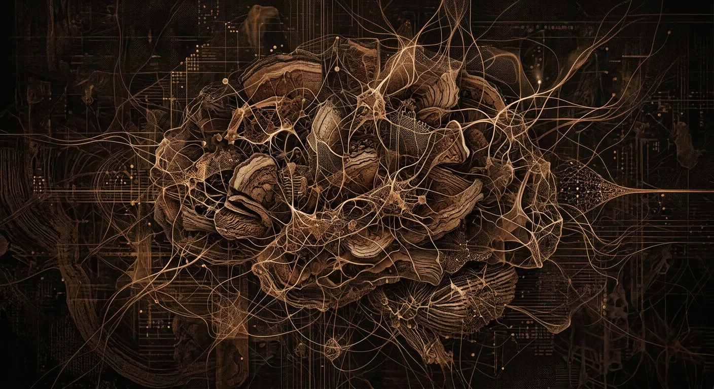
Orange is ripe citrus, embers, autumn leaves, and warning vests.
Orange feels warm and urgent because it is the exact color of things that demand your attention before they change. It belongs to fire just as it turns to coals, autumn leaves right before they rot, and sunsets in the few minutes before the light drops out completely. When you look at an apricot, a pumpkin, or a ripe mandarin, the color carries the specific promise of sugar at its peak, ready to eat now rather than tomorrow. It is an inviting warmth, but it comes with a clock attached.
That double nature makes the color naturally alerting without the raw panic of red. Road cones, life vests, and high-visibility jackets use orange because it cuts through green and gray environments while signaling a boundary you need to respect right now. Put that same flat orange onto a piece of raw steak or a clear morning sky, and the feeling instantly sours into something wrong. The vibrancy is just the collected memory of fires, falling leaves, and quick warnings staying active all at once.
Gold
Gold is coins, heavy jewelry, crowns, and late afternoon sun.
Gold feels heavy before you even touch it. That weight comes directly from its tangible presence: the solid heft of a coin, the cool mass of a ring, the thick shape of a bar sitting flat on a table. When light catches that specific yellow, your mind instantly pulls up every encounter you have ever had with real metal: the dark polished gleam of church artifacts, the stubborn weight of a crown resting on dark velvet. It is the immediate expectation of smooth cold surfaces, and things that outlast the hands holding them.
You can prove this by stripping the color away from the metal that made it. Paint that exact metallic yellow onto a cardboard box or a kitchen sponge, and the feeling evaporates instantly. It looks cheap or misplaced because the material promise has been broken. The feeling of gold only exists because the objects carrying it: coins, scepters, bullion, share its permanence, weight, and quiet coldness. The color is simply the shortcut for that entire physical reality.
Yellow
Yellow is sunshine, fire, lemons, gold, and warning signs.
Yellow feels warm and alert because it sits attached to the brightest things in our direct environment. You cannot separate the hue from midday light beating down on your skin, the open flame of a campfire, or the sharp burst of juice when you cut into a lemon. It is the color of pollen-dusted flowers pulling insects across a meadow, and because of that high visibility, it is the exact shade we paint on hazard signs to stop a fast-moving truck. Every encounter with yellow in the wild carries that same high-energy signature, combining physical heat, sudden daylight, and immediate visual urgency into a single experience.
Because the feeling is built entirely out of those real-world objects, the emotion breaks the moment you strip the color away from its context. A bright yellow lemon on a branch feels fresh and cheerful, but paint that exact same shade onto a slice of raw steak and the optimism vanishes instantly into a gut-level sense of decay. The visual input triggers a severe associative update failure, where the spatial prior of cold meat collides with the expectation of rot.
Neon
Neon is highlighters, warning signs, glow sticks, and synthetic light.
Neon feels bright because it is attached to things that are never quiet. You know the color through fluorescent highlighters bleeding through cheap notebook paper, reflective safety vests on a dark roadside, warning labels on toxic bottles, and glow sticks cracked open at midnight. The neon exit sign does not just illuminate the space, it vibrates against the damp concrete. None of these objects exist in nature. Every encounter with this color comes packed with urgency, human manufacturing, and high-energy nightlife, so the color itself takes on those traits. It feels electric, artificial, and intensely modern; every real object carrying it was built to scream for attention. Prove this by taking the color away from its objects. If you paint a wooden barn or a dry leaf in neon pink, the experience falls apart immediately. The color looks wrong: the hot, glaring pink sits on top of the grayed pine grooves and brittle veins without ever settling into them. We expect the soft matte rust of dried oak or the flat gray of wet cedar, so the sudden harsh glow feels like a glitch on the surface. The bright paint just looks like a cheap plastic coating slapped over wood that was supposed to rot, leaving the pink looking flat and out of place rather than intense.
Green
Green is leaves, grass, moss, and unripe fruit.
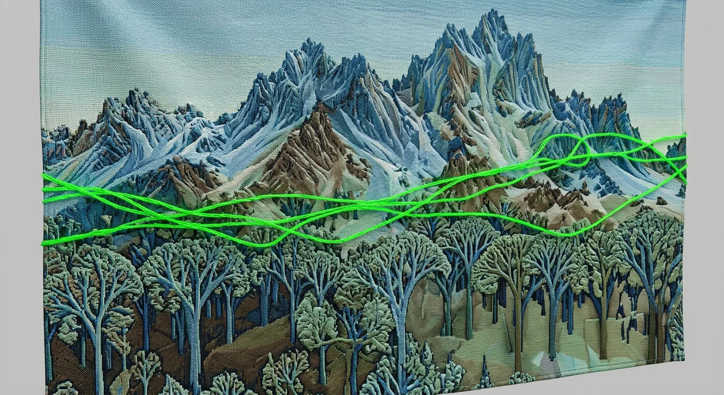
Grass, leaves, wet forests, and ripe produce all share a single surface wavelength, but the quality of green isn't sitting inside that reflected light. You feel green as life, growth, and quiet fertility because every encounter you have ever had with that shade was attached to things that are alive, fresh, and renewable. The feeling of the color is the accumulated weight of those real objects resting inside your memory, so that seeing the tint immediately calls up the sensory history of living plant tissue and shaded canopy.
Paint that exact same hue of green onto a slab of raw beef or a fresh slice of bread. The incoming wavelength is identical, but your stomach instantly turns. The sight collides head-on with every meal you have ever eaten, pulling up a sudden physical revulsion: a sudden surge of saliva, a tightening in the throat, the immediate impulse to spit it out. The color carries no independent meaning on its own; its felt sense is tied entirely to the actual growing things it belongs to. Put it on spoiled meat, and the green is no longer a quiet forest. It is poison.
Teal
Teal is shallow ocean water, copper oxide, and dark moss.
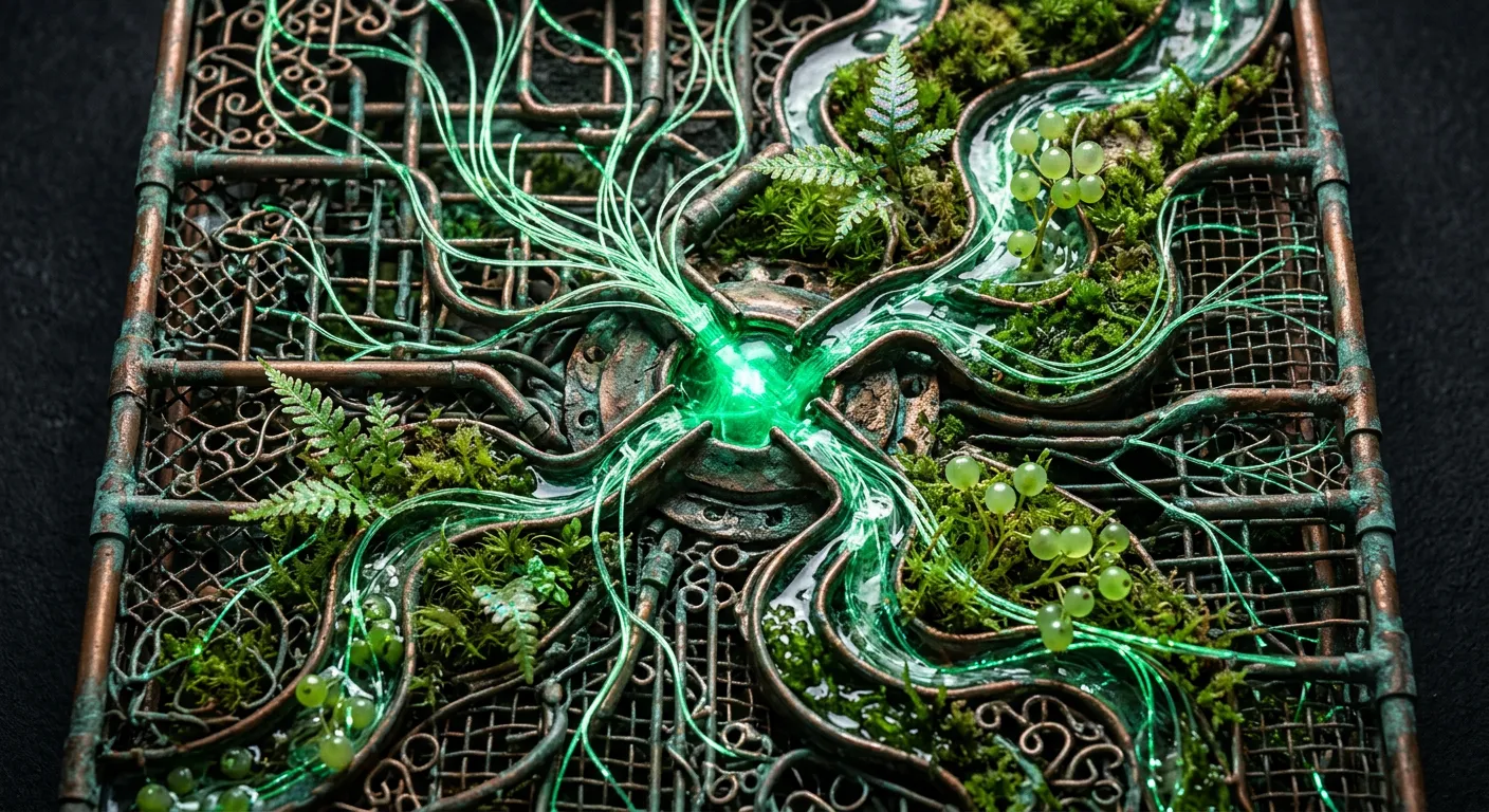
Teal feels like cold depth and quiet shelter because those are the only places it actually exists. You find it where clean, sunlit water drops off into a deep ocean trench, or inside a slab of raw jade that spent millions of years cooling under rock. It is the exact shade of heavy jungle leaves tucked deep under the canopy, where the sunlight gets filtered down until only the coolest light survives. These places are stable, old, and completely undisturbed. Looking at teal means re-entering that specific physical atmosphere of stillness, mineral cold, and shaded weight, reading the accumulated history of those environments directly off the visual signal.
The feeling belongs so entirely to those origin points that it breaks the moment the spatial context fails. Slap that same color onto a surface that is hot, dry, or actively emitting thermal heat, and the illusion shatters. The visual information becomes confusing because what we see doesn't match what we know about heat, leaving the visual information unable to make sense or create a stable impression. Paint the thin, buzzing plastic casing of a cheap space heater in deep teal and the sensory illusion just tears open. The hue sits on the hot grid like an illegible error, incapable of settling into the cold mineral weight it demands.
Blue
Blue is just the compressed memory of cold water, sky, and distant hills.
Everyone knows what blue looks like, but its peculiar coolness and its distance are harder to explain. That feeling is not a mystery locked inside the light itself. Wavelengths are just numbers, but your whole life you have seen that particular frequency sitting in the sky over your head, in the open air between you and a far-off mountain, and in deep water that gets darker as it recedes. Those real things share exact physical qualities: they are wide, quiet, cold to the touch, and impossible to hold.
The trouble starts when you try to fit that vastness into an everyday object, say a cheap blue plastic bucket under the glare of a garage tube. It feels wrong. Your eyes tell you the bucket is three feet away, hard-edged and small. But the colour itself carries a lifetime of looking at the sky. The tension you feel in that garage is the conflict between a bucket right in front of your face and a colour that belongs to the horizon.
Over years of looking, the mind binds the sight of the light to the real conditions of the things that carry it. Blue feels like open space and quiet distance because blue is the sky and the far horizon, brought indoors and mapped into your daily vision.
Grey
Grey is overcast sky, wet asphalt, stone, dust, and smoke.
Grey feels heavy and grounded because it belongs to concrete, wet asphalt, and the thick overcast right before a downpour. These are materials that do not move fast, or things that cut the glare straight out of the sky without warning. When you look at a slab of poured concrete with its air pockets and rough aggregate, there is no urge to react with sudden movement. The light scattered off these surfaces is flat, balanced across the spectrum, leaving an internal shift that settles into the background of your awareness. The tone inherits its stability entirely from the physical objects that wear it: stones stay where they are, clouds bring shade, and old roads hold their weight under traffic.
The feeling of grey belongs so tightly to these physical forms that pulling the tone away from them exposes how much work the objects were doing all along. Paint a ripe banana the precise grey of a damp cobblestone, and the familiar sense of quiet stability vanishes. The unexpected flatness of color snatches our understanding from fresh to decayed. A grey apple feels unnaturally spoiled, not peaceful.
Indigo
Indigo is twilight, deep ocean water, and rare dark stones.
Indigo feels dark, heavy, and vast because it belongs almost entirely to things that sit at the edge of our reach. It is the exact tone the sky takes during the brief window after sunset, when light drops out of the air but the night has not fully closed in yet. It is the shade of water in deep sea trenches, where the ocean gains immense pressure and loses all warmth. When you look at lapis lazuli or dark amethyst, the mineral holds that same dense, quiet weight, carrying the feel of deep earth and cold space locked together. The shade does not arrive in your mind as an isolated color. It arrives with the stillness of twilight, the cold drag of abyss water, and the permanence of old stone, all fused into a single felt intuition.
You can see how much the feeling depends on those physical origins by pulling the shade out of its natural place. Take the precise indigo of a clear dusk sky and paint it onto a piece of fresh fruit, like an apple or a strawberry. The fruit immediately looks wrong, almost toxic, because the weight and coldness of the color clash with something you expect to be warm, soft, and alive. The shade loses its quiet majesty and becomes unnatural the moment it is stripped from the sky, the sea, and the stone that gave it meaning.
Purple
Purple is rare dyes, bruises, amethyst, and expensive cloth.
Purple gets its identity because the world hands it out so sparingly. You find it locked inside amethyst crystals, pressed into the skin after a hard impact, or sitting in the crushed shells of sea snails that used to cost an entire fortune to dye a single cloak. Because it belonged only to deep minerals, physical damage, and the robes of people who commanded armies, the hue itself absorbed those conditions. It feels heavy, quiet, distant, and expensive. The color’s feeling is the accumulated weight of everything that actually carries that shade in nature and history.
The feeling belongs entirely to that specific collection of objects. If you paint a ripe banana purple, the color does not make the fruit look royal or mysterious. It just looks wrong, like a mistake or a spoiled piece of food, because the feeling of purple relies on the specific physical realities that earned it. When you strip away the gems, the marks on skin, and the rare garments, the color loses its character. The color feels mysterious only because the things that produce it have always been difficult to reach.
Pink
Pink is just skin, blossoms, and sugar remembered at once.
Pink has no dedicated wavelength in the spectrum. It only exists when red and violet light hit the eye at once while green is absent, but the actual sensation of pink comes entirely from the things that carry it through life. Pink is the color of skin when blood rises to the surface in a flush or a blush, of open tongues and gums, of cherry blossoms falling, of soft cotton blankets wrapped around a newborn, and of sugar spun thin into air. Because every one of those physical surfaces is tender, warm, edible, or young, the color itself inherits their exact physical character. You cannot separate the color from the tactile reality of what is colored; the feeling of sweetness and vulnerability is built directly out of those accumulated contacts.
This is why the feeling collapses the moment the same shade lands on an object that breaks the pattern. Paint a heavy iron anvil or a piece of rusted farm equipment the exact shade of a rose petal, and the color instantly feels surreal or absurd rather than gentle. The shade itself has not changed by a single degree, but the physical association of soft skin and delicate petals is abruptly severed by cold, hard metal. Pink feels delicate not because of some hidden property in the light, but because almost everything in nature that naturally wears it will bruise, melt, fade, or bleed if you press it too hard.